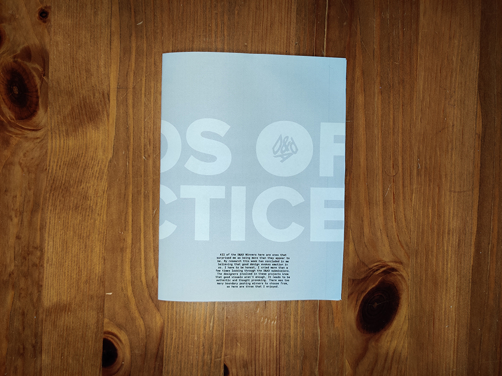
All of the D&AD Winners here are ones that surprised me as being more than they appear to be. My research this week has concluded in me believing that good design evokes emotion in us. I have to be honest, I cried more than a few times looking through the D&AD submissions. The designers involved in these projects know that good visuals aren’t enough, It needs to be authentic and thought provoking. There was too many boundary pushing winners to choose from, so here are three that I enjoyed.
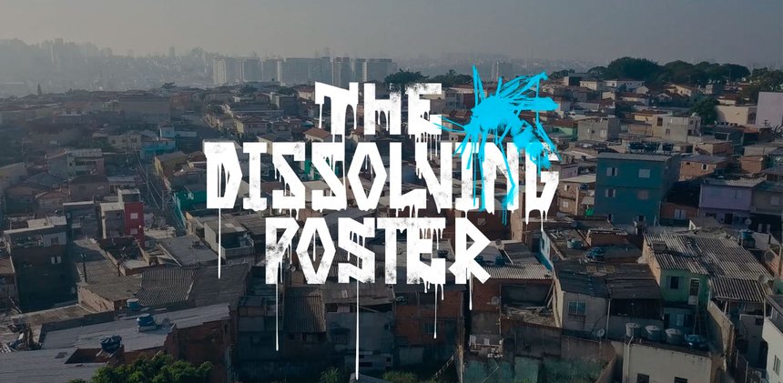
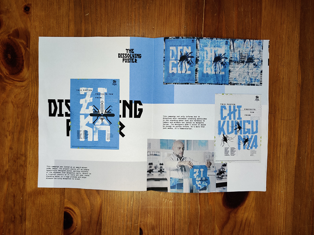
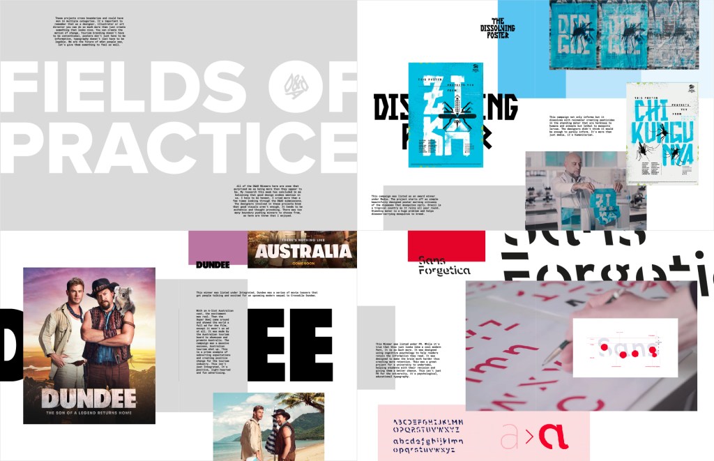
The Dissolving Poster – This campaign was listed as an award winner under Media. This project starts off as simple beautifully designed poster warning citizens of the diseases that mosquitos carry. Brazil is a tropical country so it rains all year round. Standing water is a huge problem and helps disease-carrying mosquitos to breed. This poster not only informs but it dissolves with rainwater creating pesticides in the standing water that are harmless to humans and animals but lethal to mosquito larvae. The designers didn’t think it would be enough to purely inform. It’s more than just media, it’s humanitarian. https://www.dandad.org/awards/professional/2019/media/230733/the-dissolving-poster/
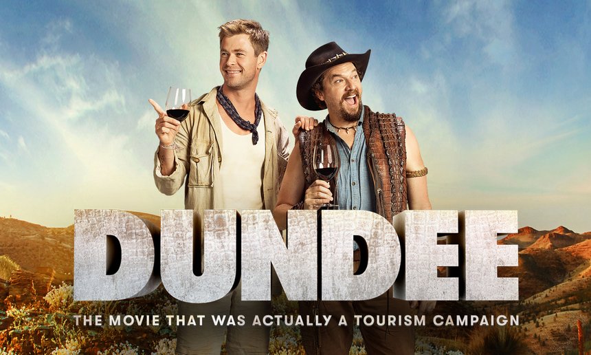
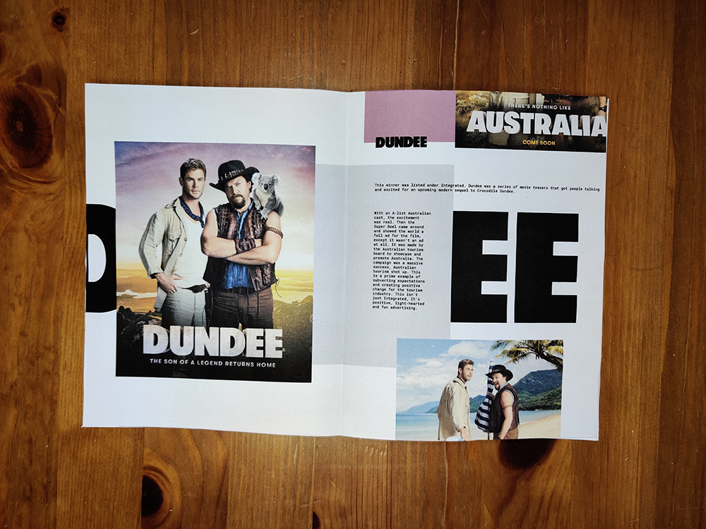
Dundee – This winner was listed under Integrated. Dundee was a series of movie teasers that got people talking and excited for an upcoming modern sequel to Crocodile Dundee. With an A-list Australian cast, the excitement was real. Then the Super Bowl came around and showed the world a full ad for the film, except it wasn’t an ad at all. It was made by the Australian tourism board to showcase and promote Australia. The campaign was a massive success, Australian tourism shot up. This is a prime example of subverting expectations and creating positive change for the tourism industry. This isn’t just Integrated, It’s positive, light-hearted and fun advertising. https://www.dandad.org/awards/professional/2019/integrated/230803/dundee-the-son-of-a-legend-returns-home/
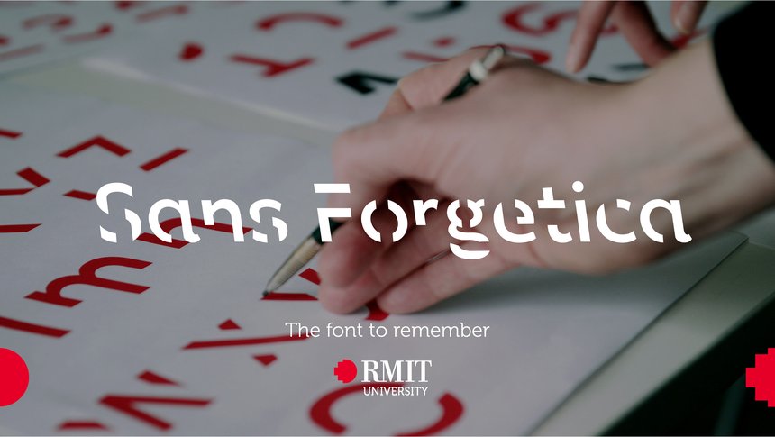
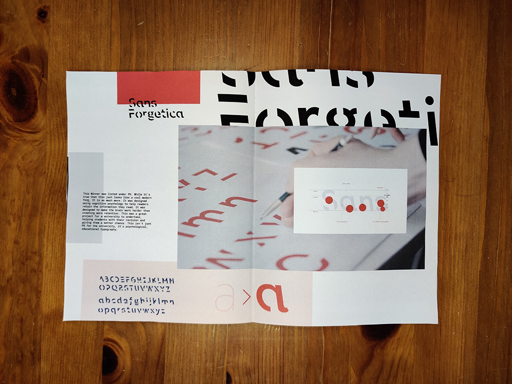
Sans Forgetica – This Winner was listed under PR. While it’s true that this just looks like a cool modern font, It is so much more. It was designed using cognitive psychology to help readers retain the information they read. It was designed to make the brain work harder thus creating more retention. This was a great project for a university to undertake, helping students with their revision and giving them a better chance. This isn’t just PR for the university, it’s psychological, educational typography. https://www.dandad.org/awards/professional/2019/pr/230324/sans-forgetica/
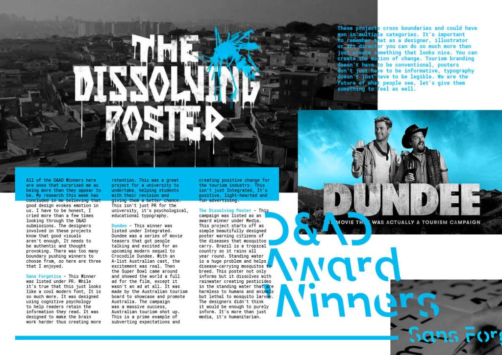
Conclusion – These projects cross boundaries and could have won in multiple categories. It’s important to remember that as a designer, illustrator or art director you can do so much more than just create something that looks nice. You can create the motion of change. Tourism branding doesn’t have to be conventional, posters don’t just have to be informative, typography doesn’t just have to be legible. We are the future of what people see, let’s give them something to feel as well.
Reflection and development
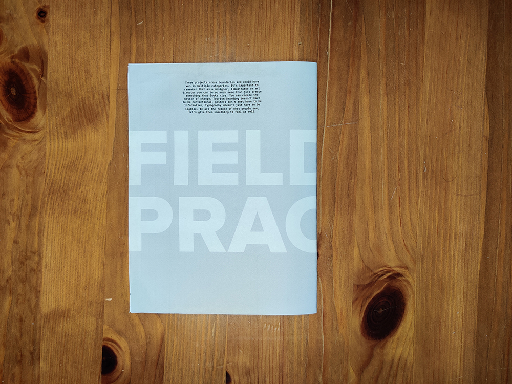
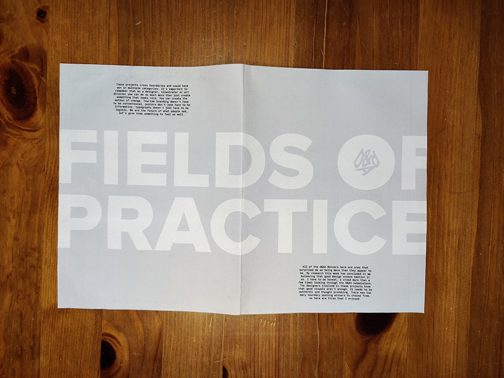
After finishing this weeks workshop challenge I was happy with my outcome. A week later, however, while re looking at it I realised that there was no real context to it. I’d just turned my findings into a pdf spread. Why is it a pdf spread? I decided I would take all of the elements I liked (using the fonts that were used in the projects and the overlapping colours) and turn it into a little ’best of show’ booklet. I’m imagining that every D&AD project has a printable spread and you can put 3 of your favourites together.
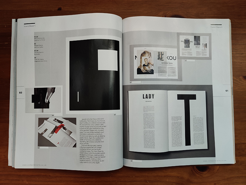
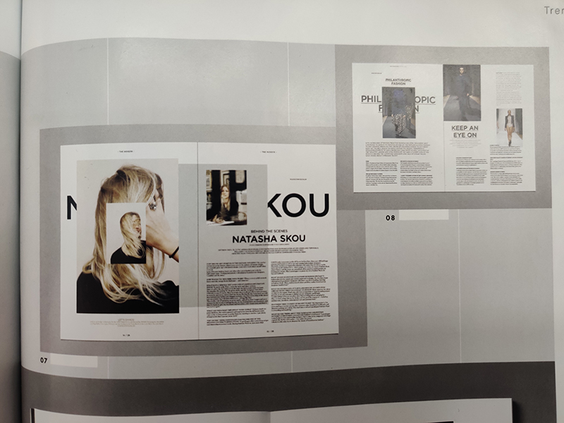
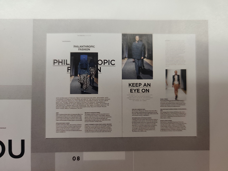
I found this style when flicking through an old creative arts magazine from 2012 that I had found. I really liked the overlaid concept and thought it fit well with my ‘overlapping’ category theme. This publication is the Vision Paper by Brunswicker. I put my spin on it by incorporating the colours and typefaces used in the work that I was displaying. I didn’t have a lot of text to work with as the whole booklet was limited to 500. I wanted to keep it spacious yet slightly chaotic. I’m finally happy that I’ve given this week’s project the context it deserved.
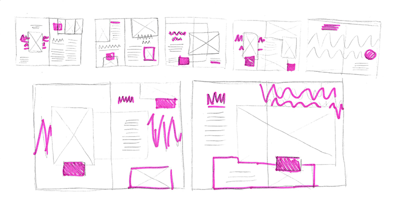
Some new thumbnail sketches:
New Final Piece
