I’m sure, as many of you already know, Pantone release a ‘Colour of the year’ every December (for the year to come). This has been a tradition for 20 years. What I didn’t know is that apparently this has some clout. “For over 20 years, Pantone’s Color of the Year has influenced product development and purchasing decisions in multiple industries, including fashion, home furnishings, and industrial design, as well as product packaging and graphic design.”
https://www.pantone.com/color-intelligence/color-of-the-year/color-of-the-year-2020
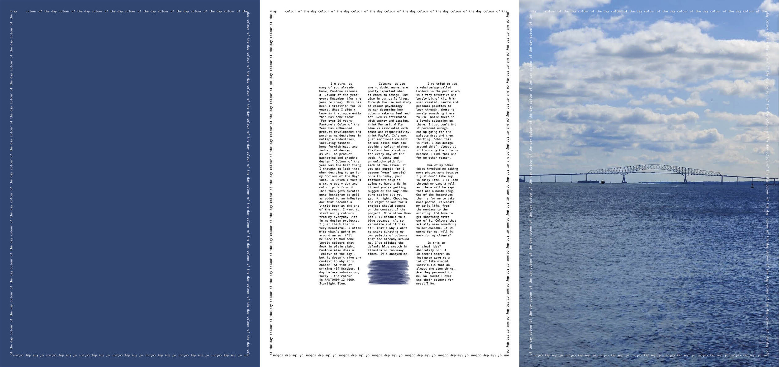
Colour of the year was the first thing I thought to look into when deciding to go for my ‘Colour of the Day’ idea. In which I take a picture every day and colour pick from it. This then gets curated onto instagram as well as added to an inDesign doc that becomes a little book at the end of the year. I want to start using colours from my everyday life in my design projects. I just think that’s very beautiful. I often miss what’s going on around me so it’ll be nice to find some lovely colours that float in plain sight.
Pantone also does a ‘colour of the day’, but it doesn’t give any context to why it’s chosen. At time of writing (14 October, 1 day before submission, sorry…) the colour is PANTONE® 12-4609, Starlight Blue.
Colours, as you are no doubt aware, are pretty important when it comes to design. But also in our daily lives. Through the use and study of colour psychology we can determine how colours make us feel and act. Red is attributed with energy and passion, think Ferrari. While blue is associated with trust and responsibility, think PayPal.
It’s not just emotional context or use cases that can decide a colour either. Thailand has a colour for every day of the week. A lucky and an unlucky pick for each of the seven. If you use purple (or I assume ‘wear’ purple) on a Thursday, your restaurant soup is going to have a fly in it and you’re getting mugged on the way home, pure satire but you get it right.
Choosing the right colour for a project should depend on the context of the project. More often than not I’ll default to a blue because it’s so versatile and ‘I like it’. That’s why I want to start curating my own palette of colours that are already around me. I’ve clicked the default blue swatch in Illustrator too many times and It’s annoyed me.
I’ve tried to use a website/app called Coolors in the past which is a very intuitive and lovely bit of kit. With user created, random and personal palettes to look through, there is surely something there to use. While there is a lovely selection on their, I just don’t find it personal enough. I end up going for the palette first and then thinking, “ohhh this is nice, I can design around this”, almost as if I’m using the colours because I like them and for no other reason.
One of my other ideas involved me taking more photographs because I just don’t take any in daily life. I’ll look through my camera roll and there will be gaps that are a month long. One of the incentives then is for me to take more photos, celebrate my daily life, from the mundane to the exciting. I’d love to get something extra out of it. Colours that actually mean something to me? Awesome. If it works for me, will it work for my clients?
Is this an original idea? Absolutely not. A 10 second search on instagram gave me a lot of like minded individuals that do almost the same thing. Are they personal to me? No. Would I ever use their colours for myself? No.
These are 3 examples:
https://www.instagram.com/awsmcolor/?hl=en
https://www.instagram.com/color_ofthe_day/?hl=en
https://www.instagram.com/_world_of_coloured_wonders/?hl=en
The spread