This week’s lecture material centred around Semiotics and its relationship to local and global graphic design. A good summary of this would be in Martin’s conclusion, “The meaning of a text is not inherent within the text itself but is created within the relationship of the text, the reader, and the original psychological image that was intended.” Let’s take a look at this KFC ad campaign by Mother.

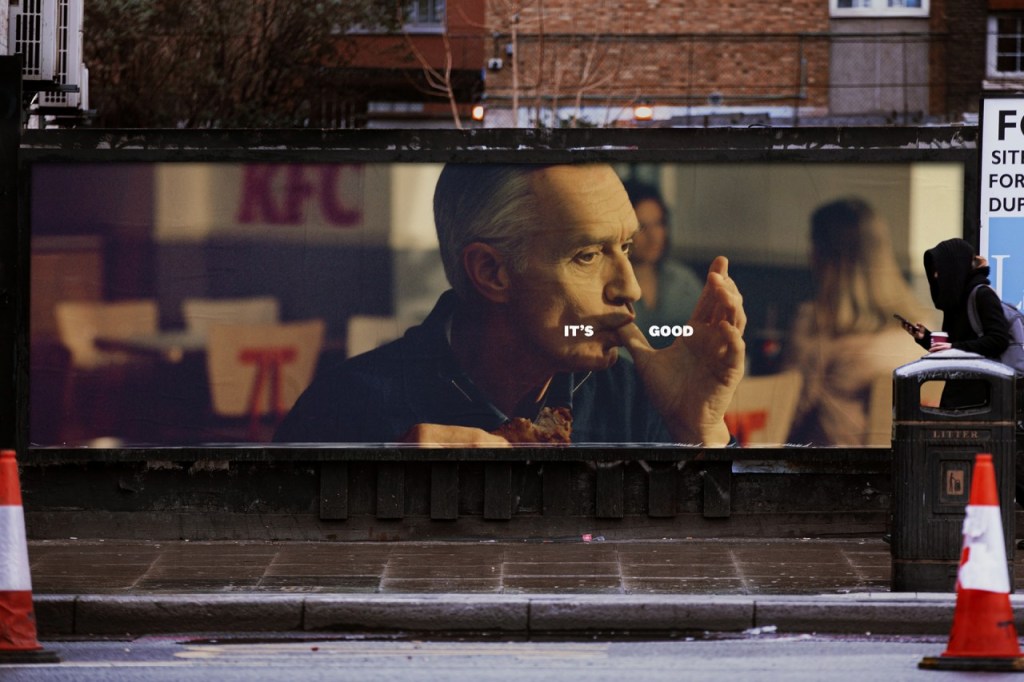

Without the context of KFC’s 30 year slogan “It’s finger lickin’ good” This campaign wouldn’t mean anything. It’s the audiences relationship with the brand and the act of licking your fingers after a delicious greasy meal coupled with the intent to make you hungry and thus want a KFC that makes this campaign work.
It’s interesting to me that we see signs, symbols and imagery every day that we ignore purely because the context of said objects are not known to us. Even if it’s not obvious, there is always intent within the manmade visuals we see. The below image from the book Visible Signs by David Crow, illustrate that there could be any number of ways to communicate ‘NO SMOKING’ effectively but as a culture we have only adopted a cigarette with a circle and a line through it. As a society, we have agreed upon an icon and given it context and intent.

It’s also important to note that we don’t need to see a photorealistic cigarette to be able to identify it. Without the intent of the author and the context of our societal reasoning, these icons mean nothing.
