I’m lucky enough to be friends with a published poet from the States. Darius Atefat-Peckham and his family have been through tough times, he lost his mother and little brother in a car accident during a vacation to Jordan. Only himself and father Joel survived. Joel is also a poet, as well as his deceased mother Susan. Darius is only 18 yet he has a number of published works and started attending Harvard University this year. Having known the family for years I knew that I had to honour them this week.
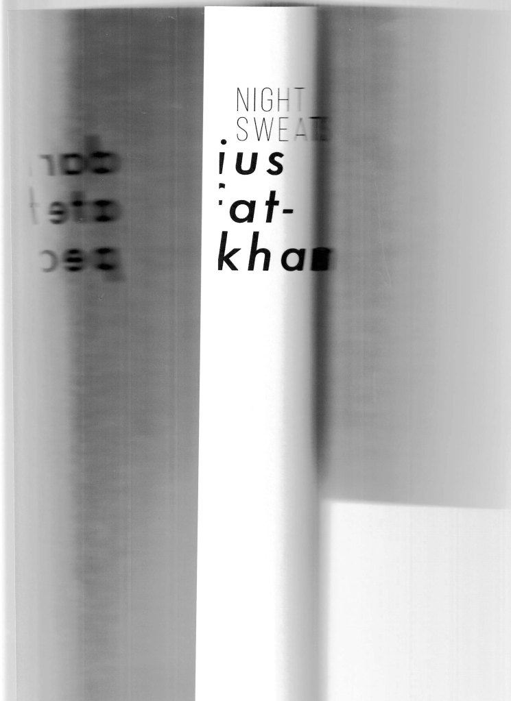
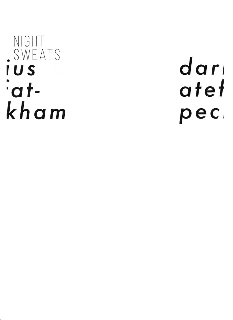
Darius’s poems are deeply introspective and emotional and the one I have chosen is called ‘Night Sweats’
Read the full poem here if you’d like:
https://www.juxtaprosemagazine.org/night-sweats-by-darius-atefat-peckham/
There are a few verses that got to me, one of which being an arrangement of words between him and his father, and another being the spirit of his brother being with him. The verses are raw and emotional and I really want to do them justice as a sensitive topic.
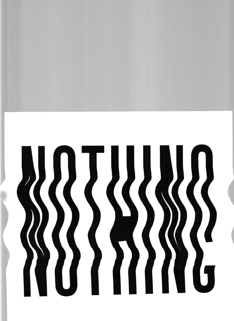
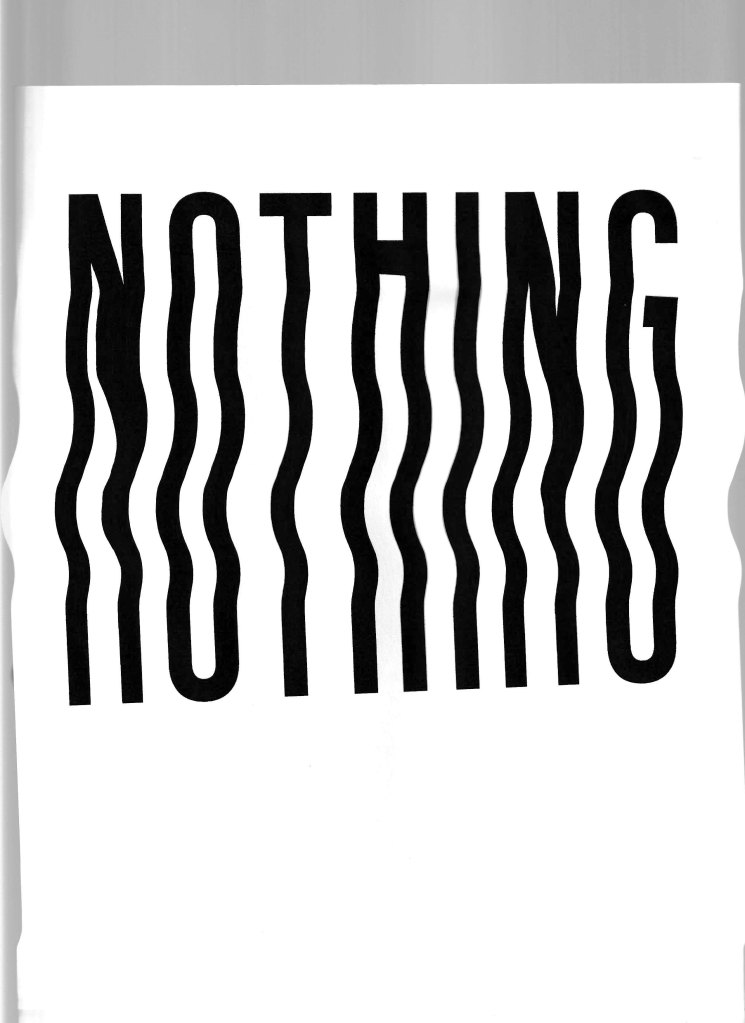
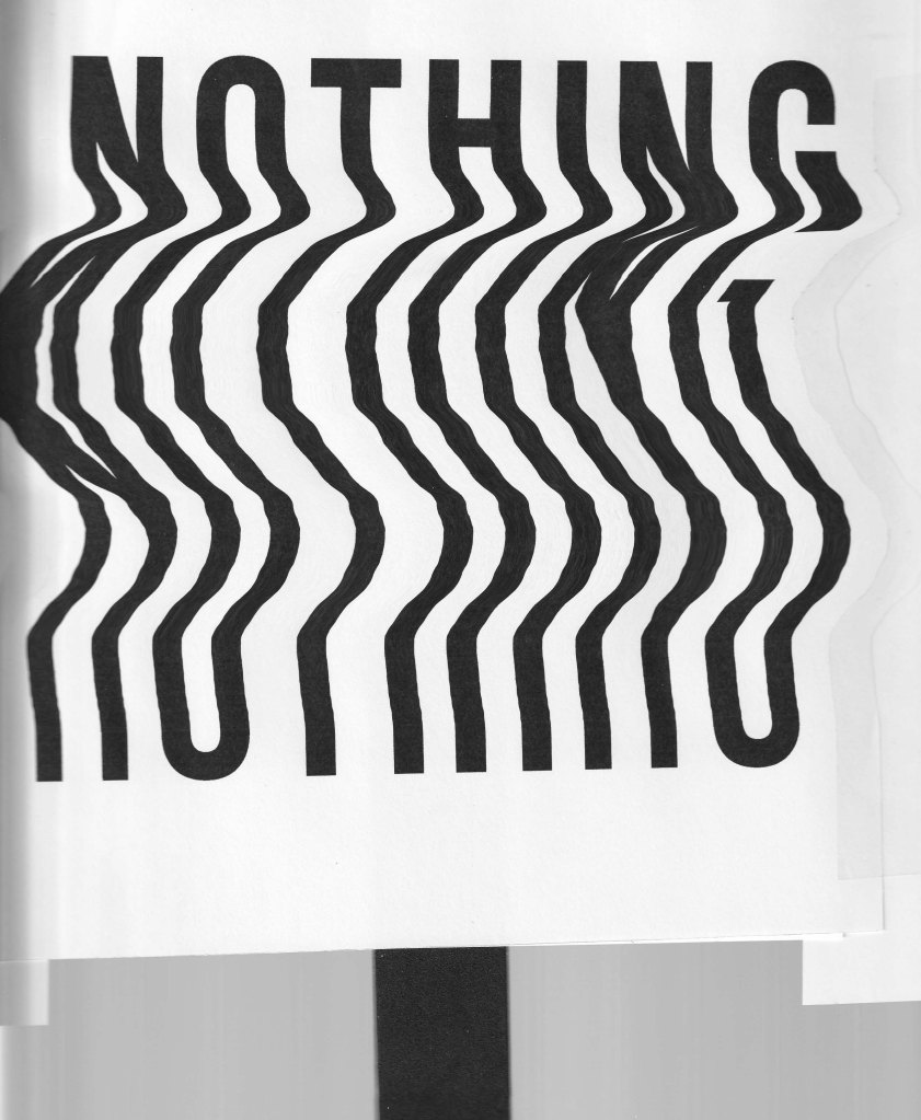
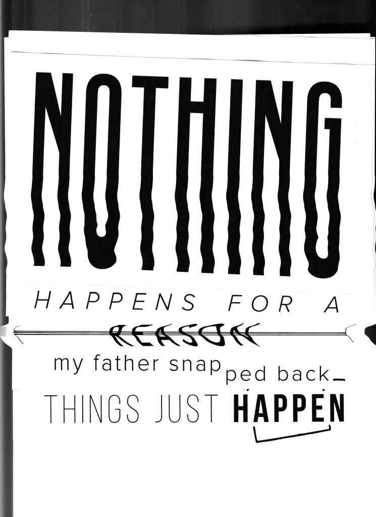
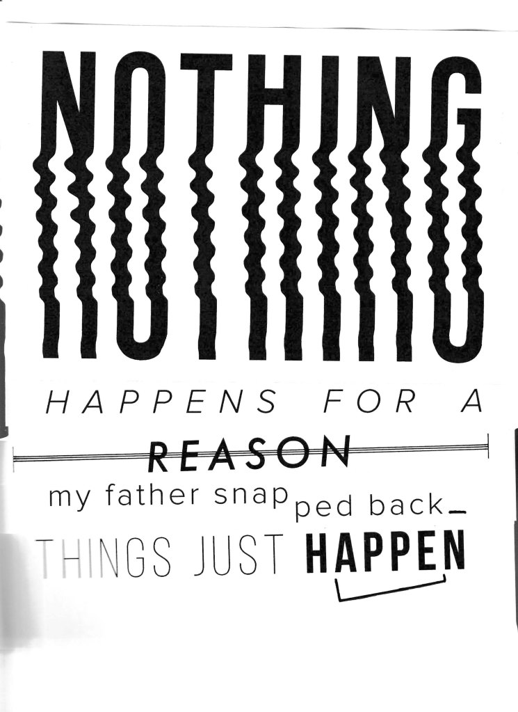
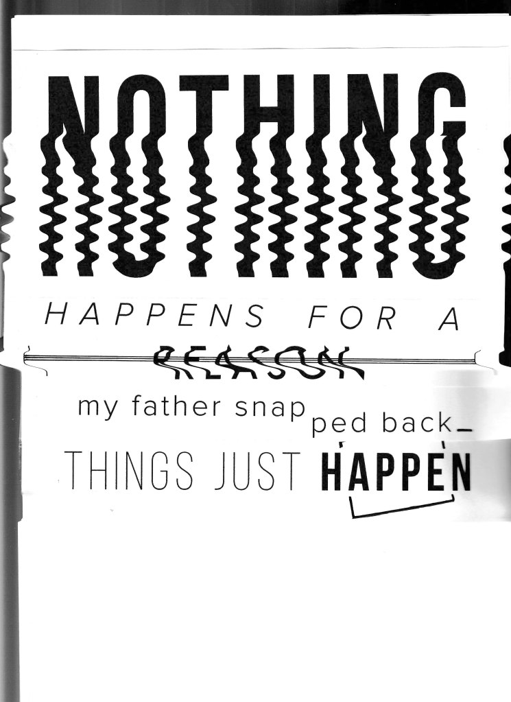
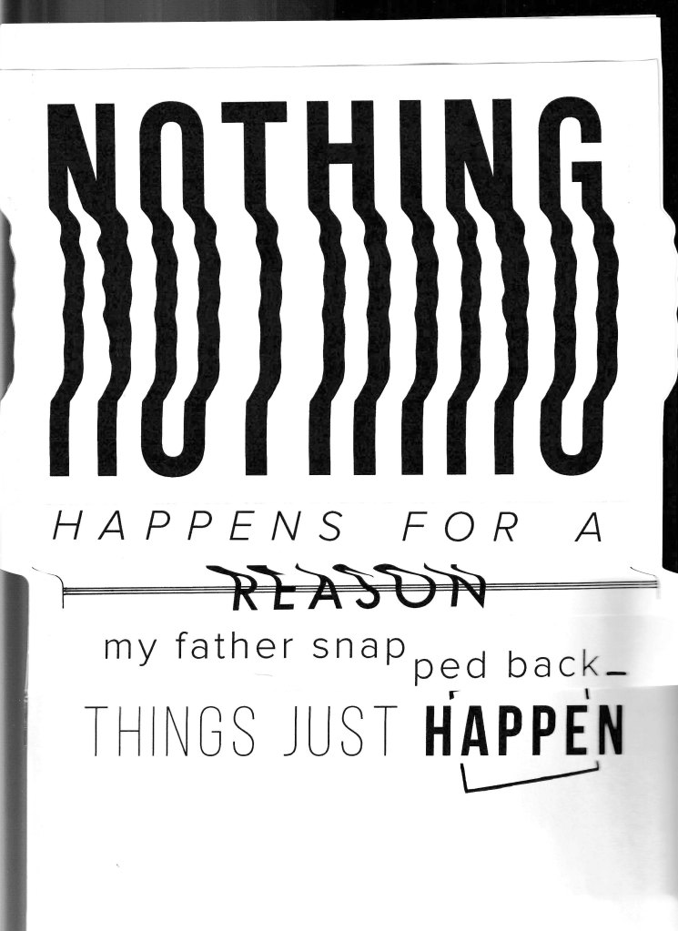
Emphasising emotion through typography.
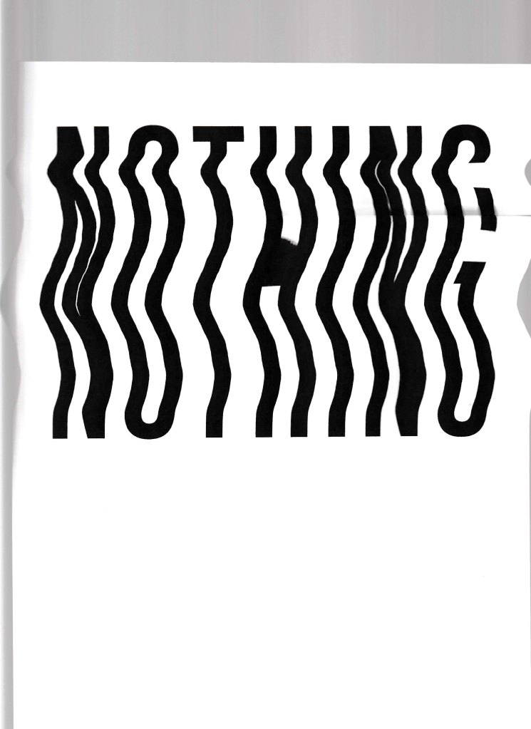
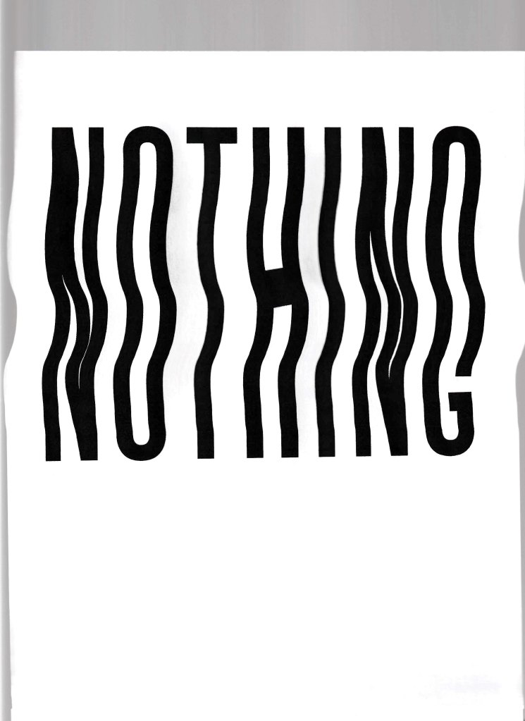
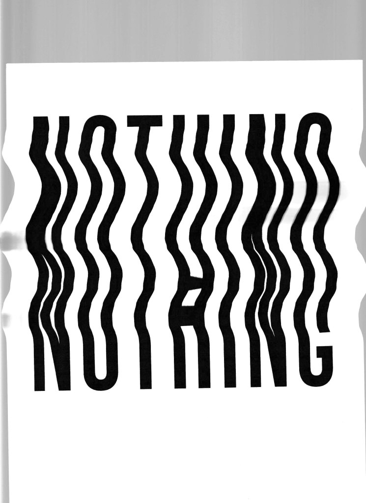
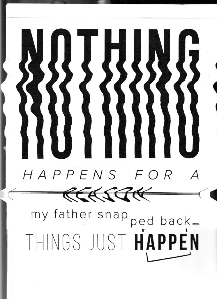
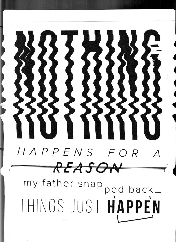
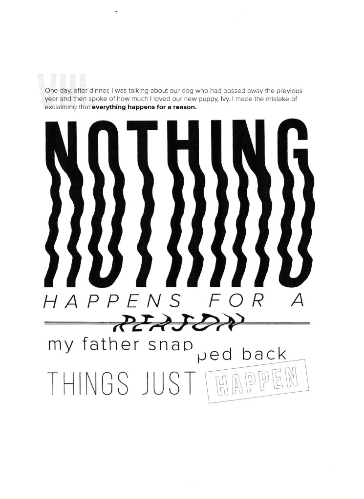
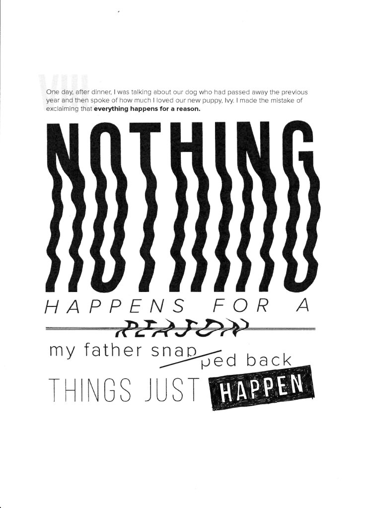
Verse Viii.
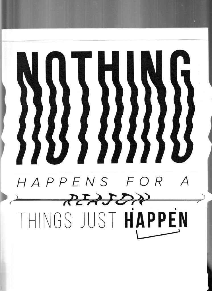
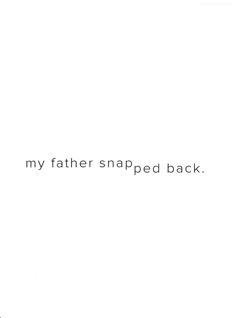
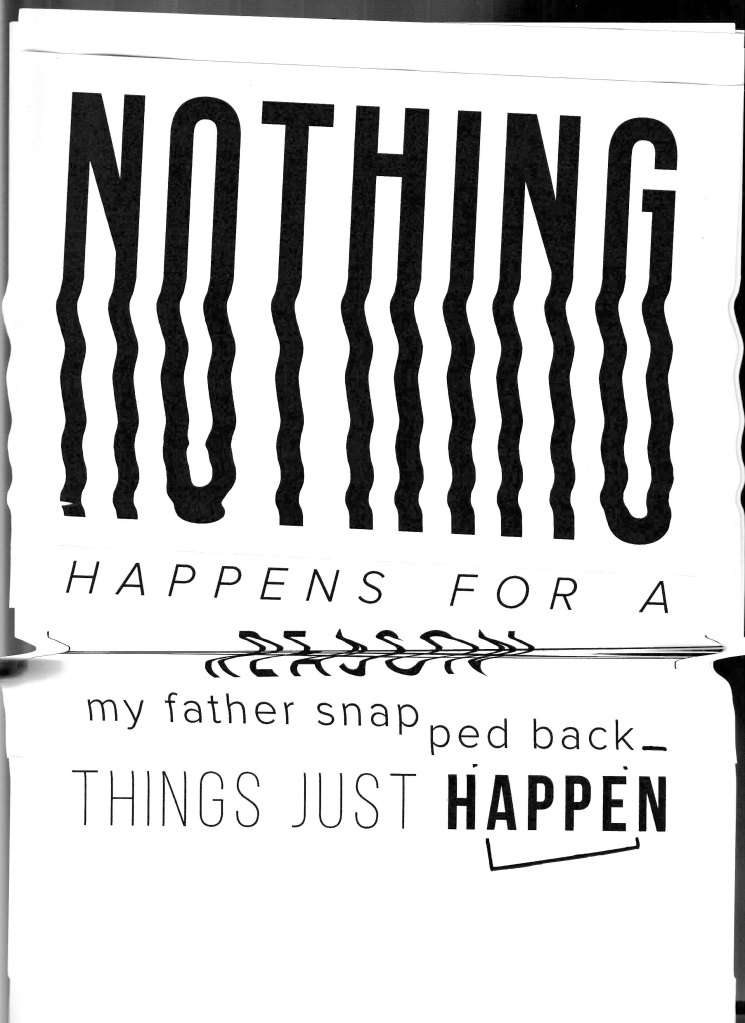
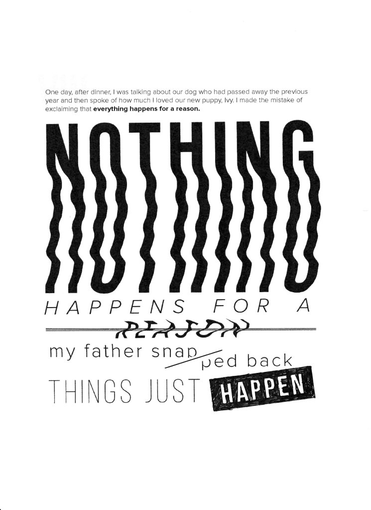
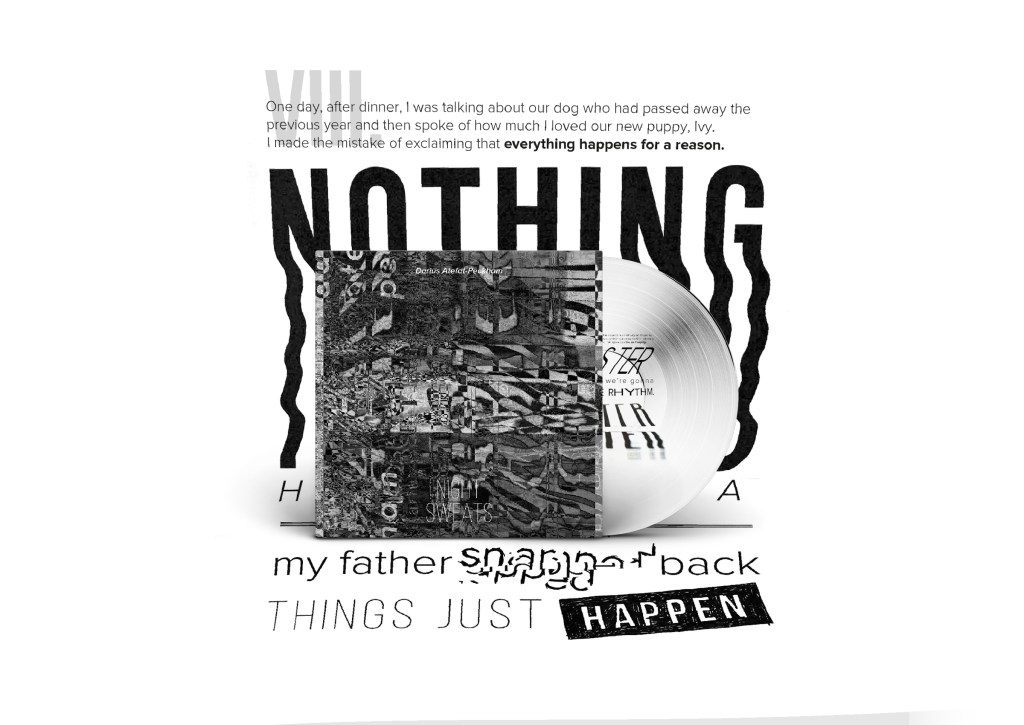
One day, after dinner, I was talking about our dog who had passed away the previous year and then spoke of how much I loved our new puppy, Ivy. I made the mistake of exclaiming that everything happens for a reason. Nothing happens for a reason, my father snapped back.
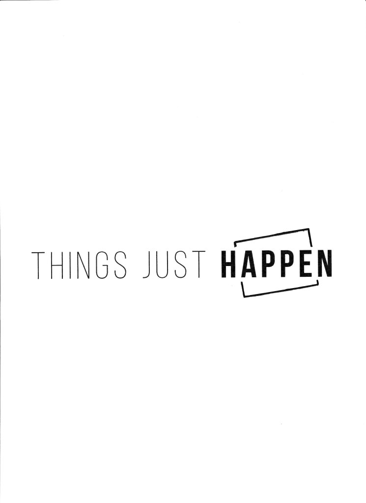
Things just happen.

I’ll be focusing on the last two lines and their context. ‘Nothing happens for a reason’. ‘Nothing’ is the main focus here. I really wanted this word to drag the reader down and be the first thing they see. The word is hazy yet clear. If spoken aloud it would seem unsettling with a slight quiver. Life perceptions have been altered dramatically.
The next main typographic element is the word ‘Reason’. Even hazier than the last with multiple lines struck through. A decision has been made to strike off the use of this word. It’s barely recognisable. Reason barely exists. ‘Snapped’ has been cut in two, as if the snapper is in half a mind. It’s an honest statement from a child, but a harsh one for a lover and father.
‘Happen’. Hand scrawled or stamped onto the page. As if the word, so heavy in context, came hurtling out and struck with resolve.
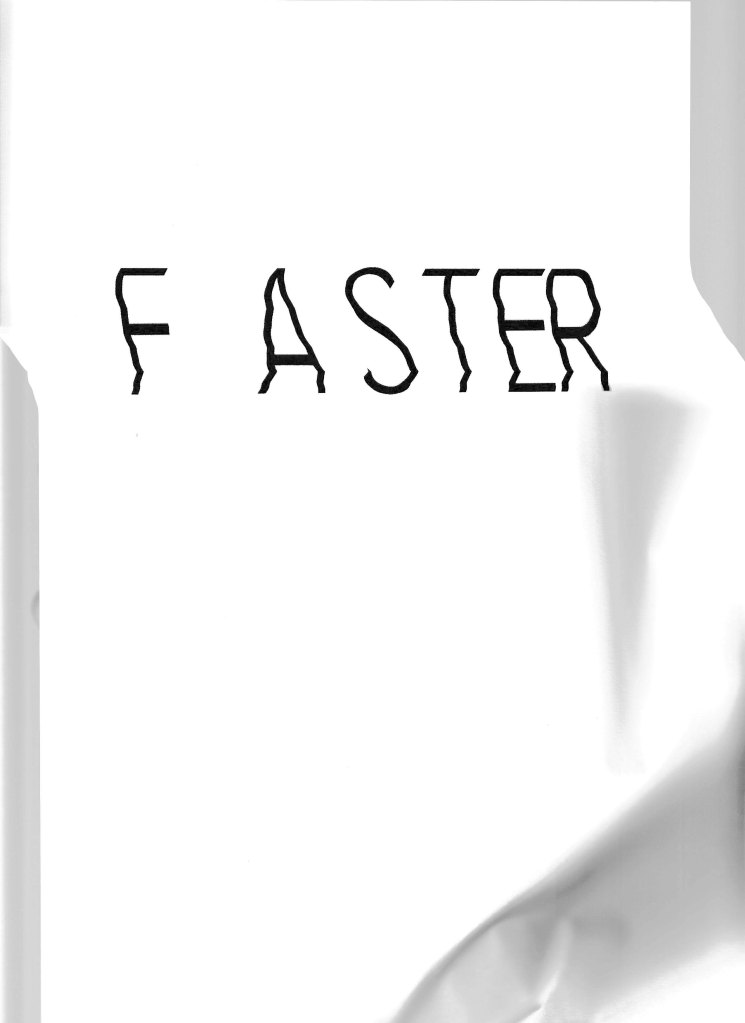
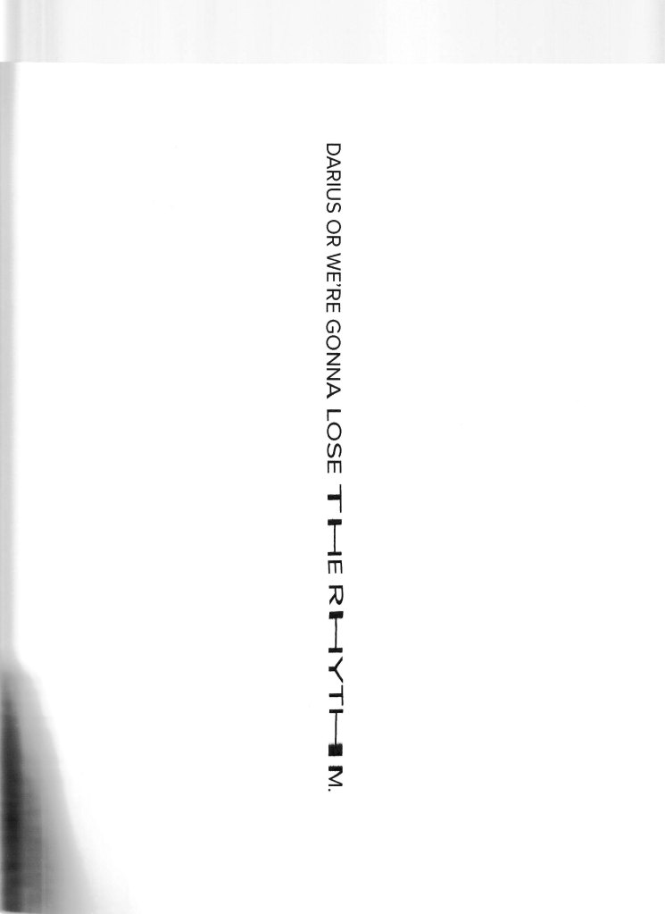
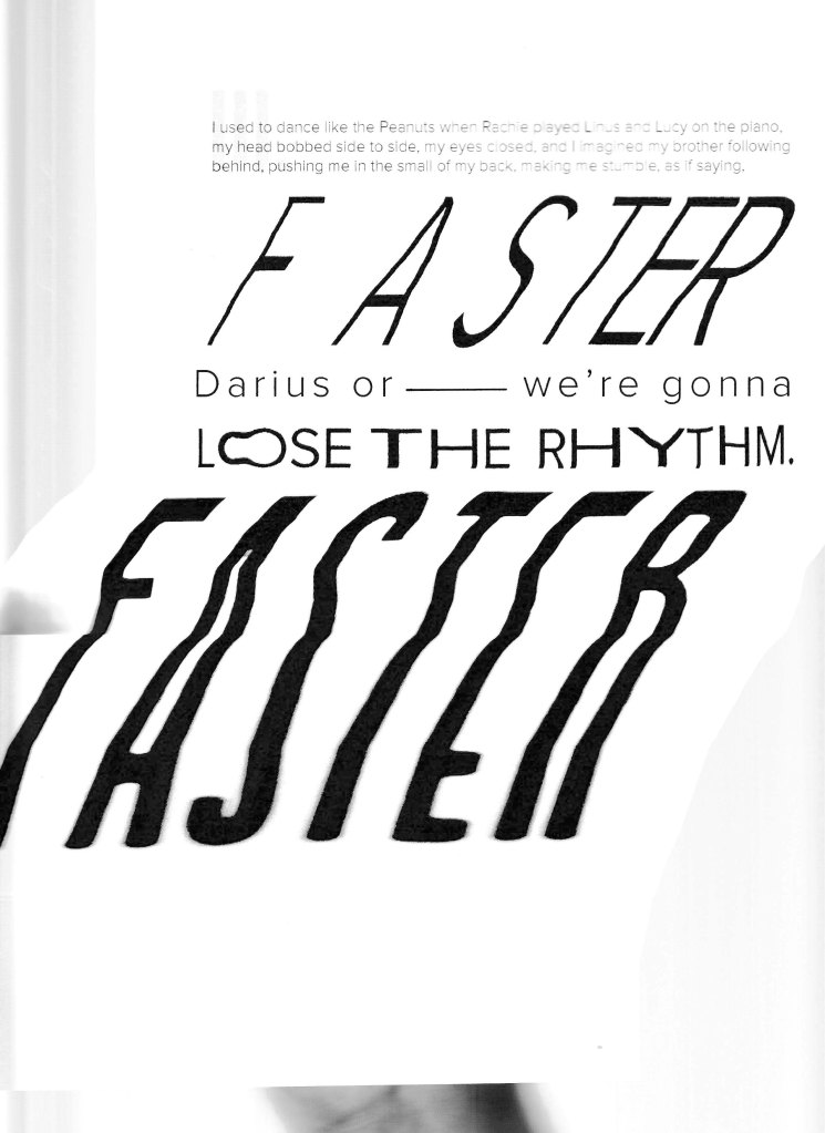
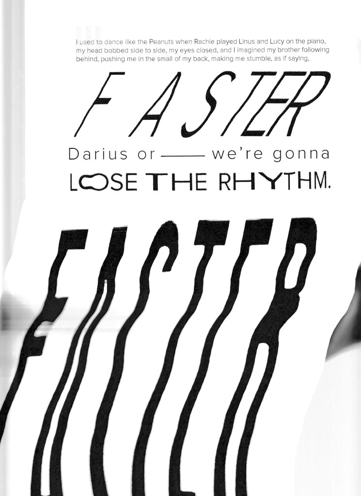
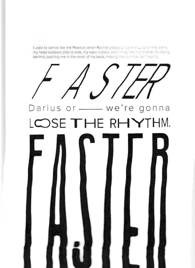
Verse iii.
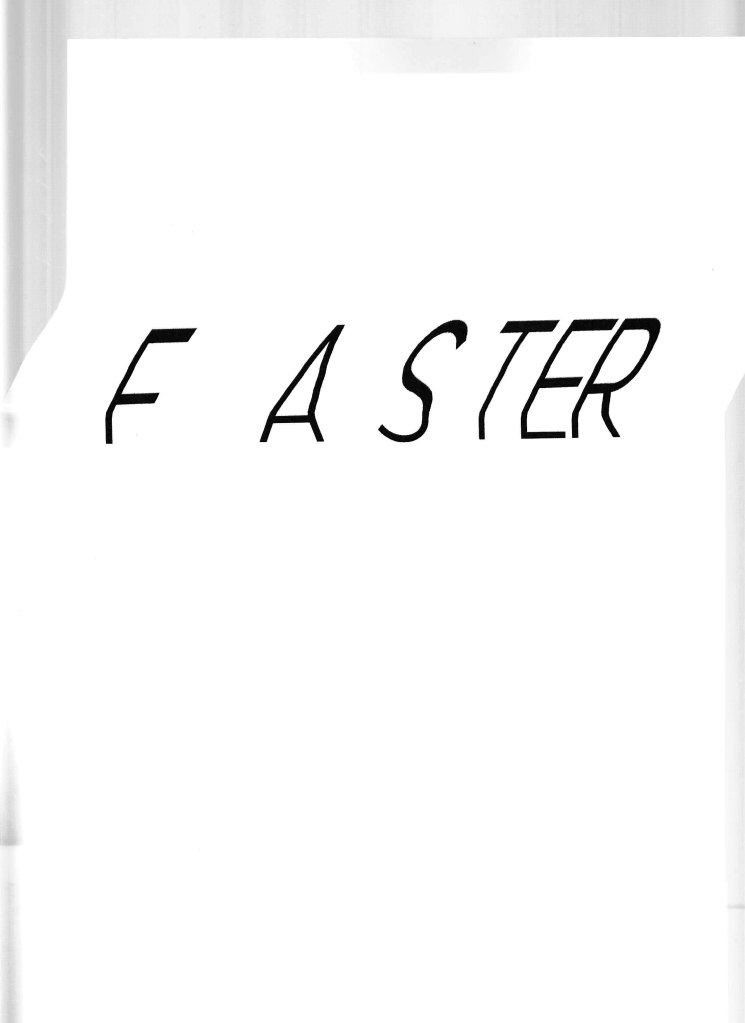
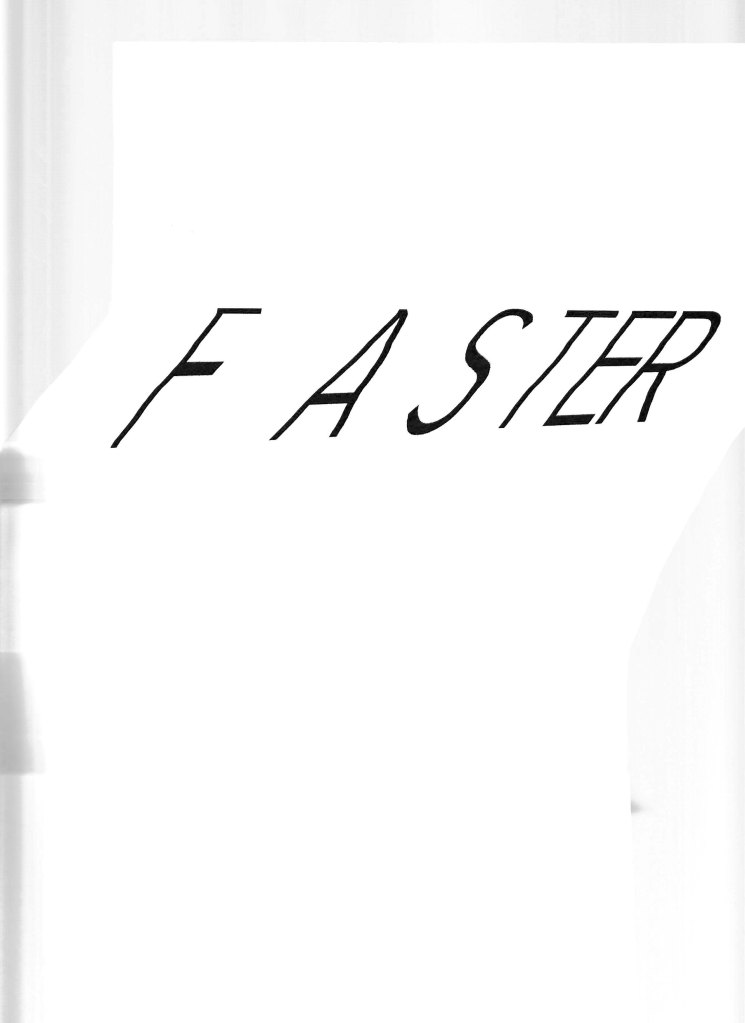
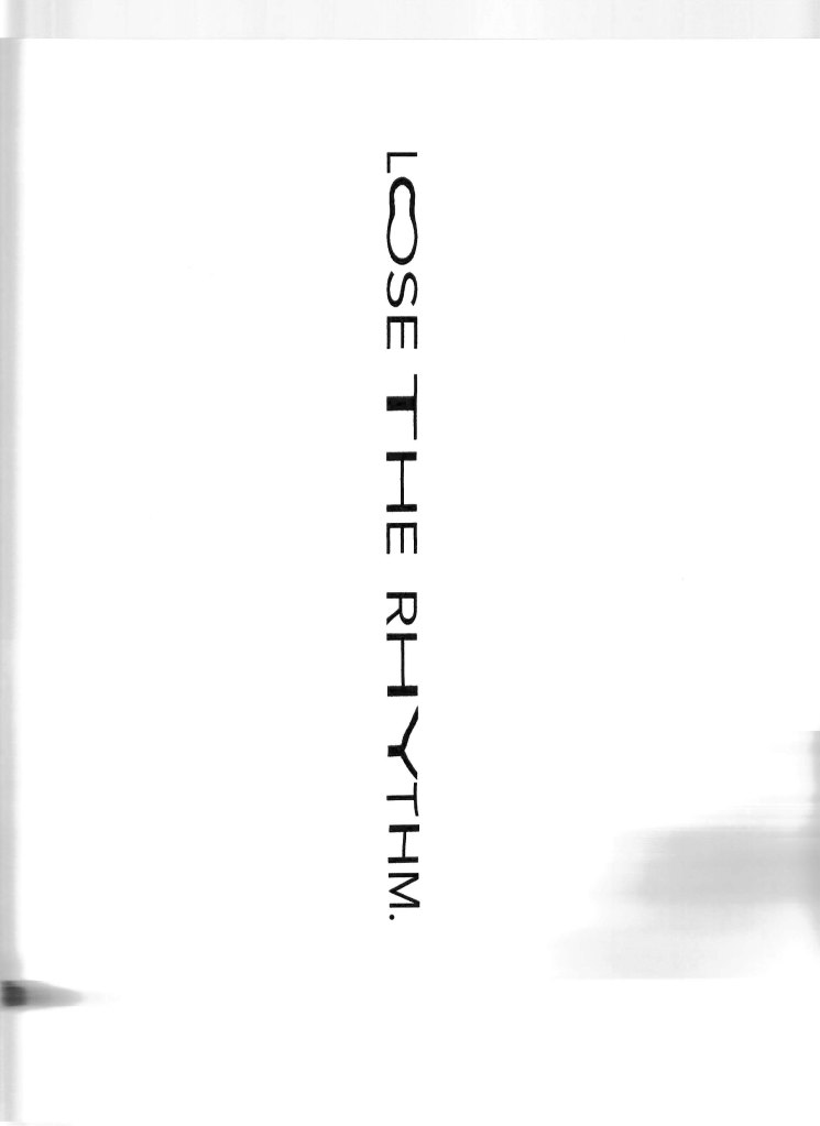
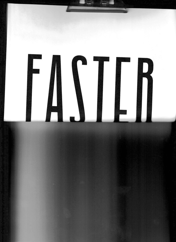
I used to dance like the Peanuts when Rachie played Linus and Lucy on the piano, my head bobbed side to side, my eyes closed, and I imagined my brother following behind, pushing me in the small of my back, making me stumble, as if saying, Faster Darius or we’re gonna lose the rhythm. Faster.
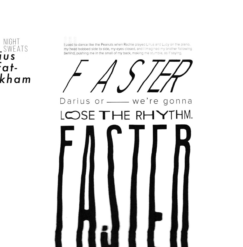
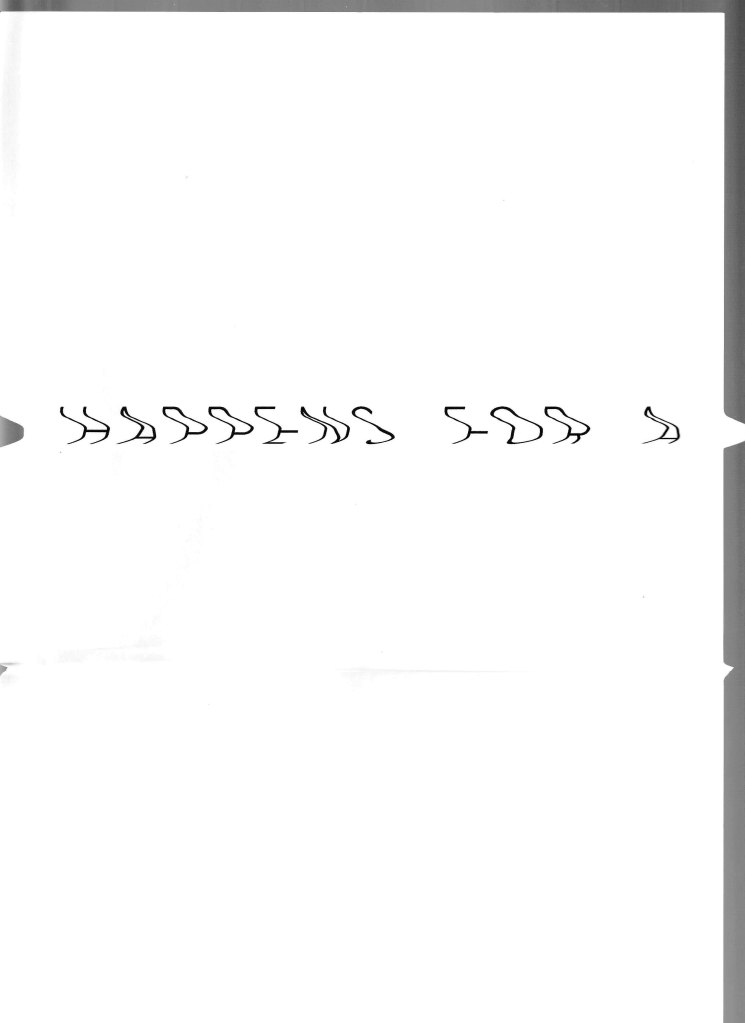
Again I will be focusing on the final quote. ‘Faster’ the letters getting spaced closer together as the word continues. The word is thin and skewed, no time to look back into the past.
The ‘–’ inbetween ‘Darius or’ and ‘we’re gonna’ is longwinded and slow in contrast. It breaks up the sense of speed, messing with the timing. Time is slipping away.
‘Lose the rhythm’ is warped. The length and thickness of words and letters are non-linear, the sense of time has shifted once again making it hard to follow.
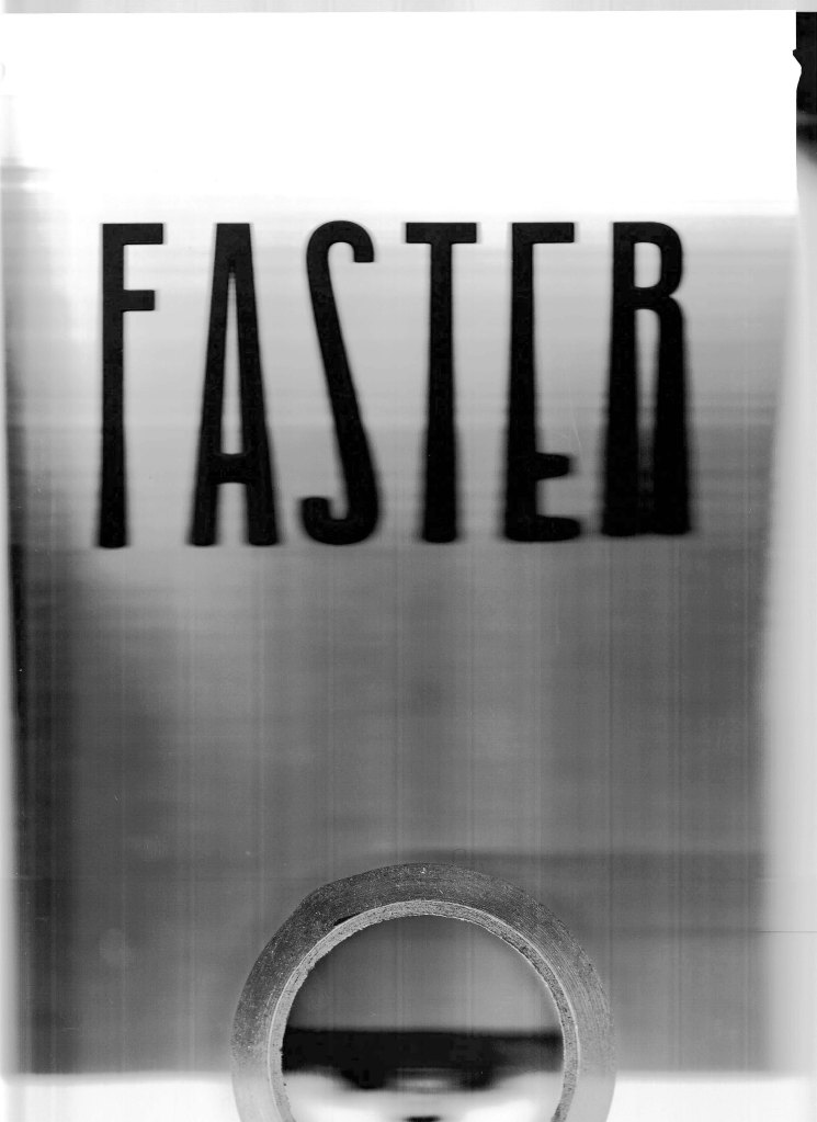
The final ‘Faster’ is drifting further away, becoming blurry and unclear. It’s leaving the canvas. Darius’s perception of the song and the sudden thoughts of his brother are leaving him.


How these were made
Printing off one or a few words at a time and scanning them back in with movement or ink added. A complete copy of scans (experiments and finals) in the gallery below:


Development
After getting some feedback from Sarah I decided to change the way some words were displayed. Skewing them further and adding in more processes. The first change was the word ‘snapped’. I printed out the sentence and then the word on its own. I then cut up the word and stuck it back over the original loosely. It gives it a cracked and displaced aesthetic and really emphasises the trauma that was learned in order to use the word.
The next change was in the second verse. I liked the second ‘FASTER’ but Sarah suggested some extra exploration and I’m so glad I did. To create this I took a photo of the paper at a low perspective to show the word slipping away. I then printed out the new perspective and scanned it in again. I used another piece of paper to stab the bottom of the word as it was travelling down the scanner. This jolted the whole word and added a break and a blur.
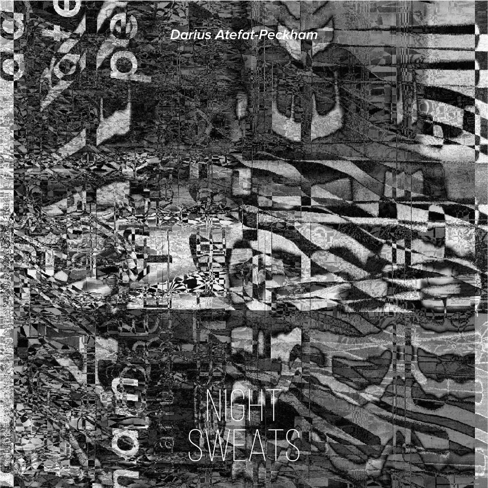
I also created a ‘record cover’ for the piece. I folder which the 2 square artworks could fit in. It also works as a nice set of 3. To make the cover I put every single scan into photoshop and layered them all together. Creating an awesome Damascus look which exudes chaos and emotion.


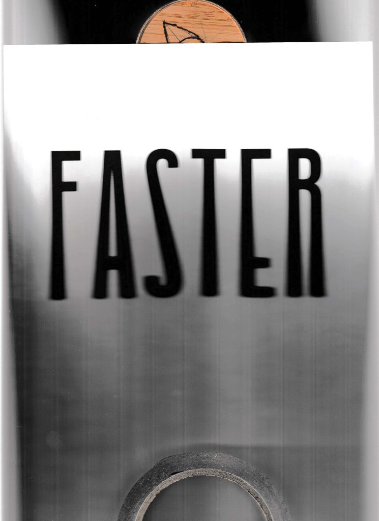
As Darius and his family are avid musicians I decided to turn this design into a record and sleeve. After talking with Sarah, she pointed out the work of Barbara Kruger and her typography exhibition. She has blown up words to fill the walls of the entire space to create a dramatic and emotional effect. I decided to use my artwork and see what it would look like.
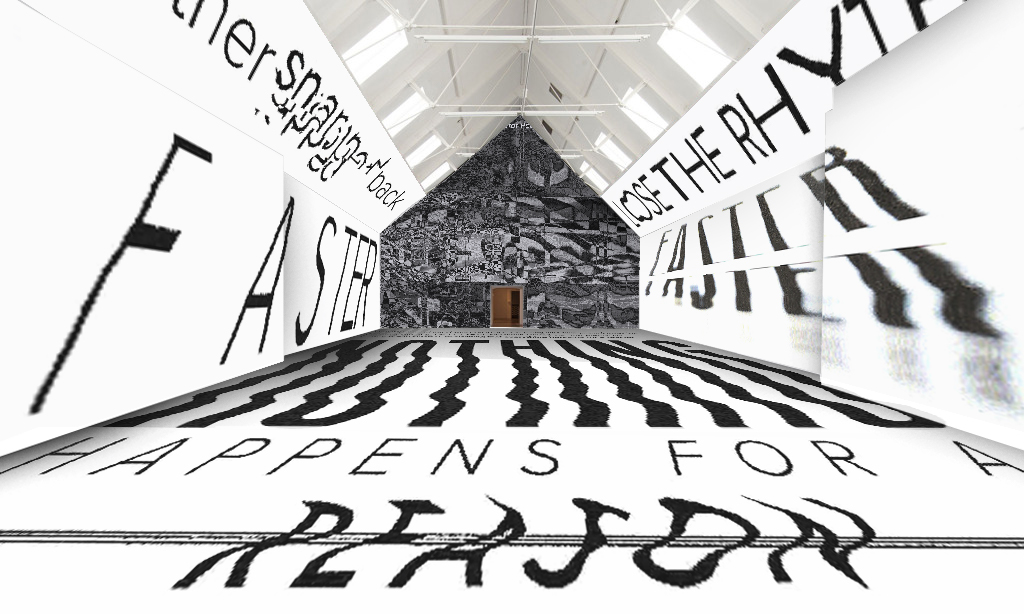
It definitely gives the space a sense of chaos and emotion as it’s making you look at the physical state of the words at a large scale.
Reflection
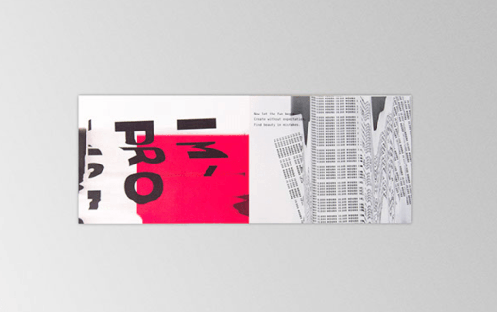
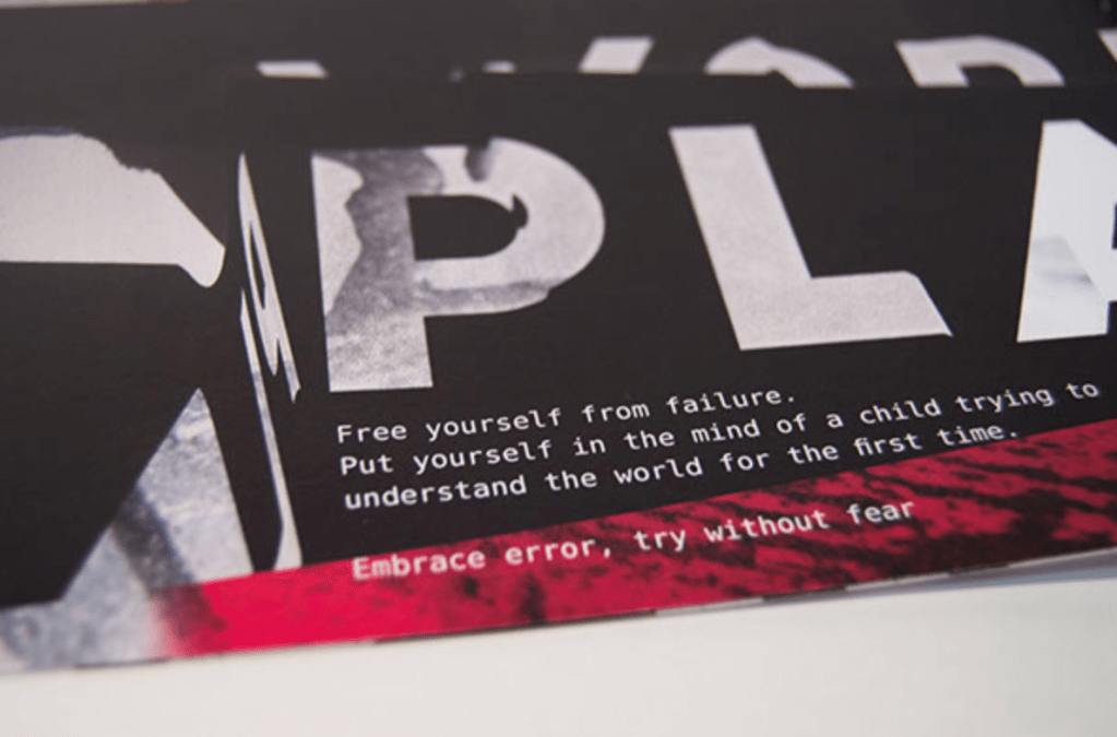
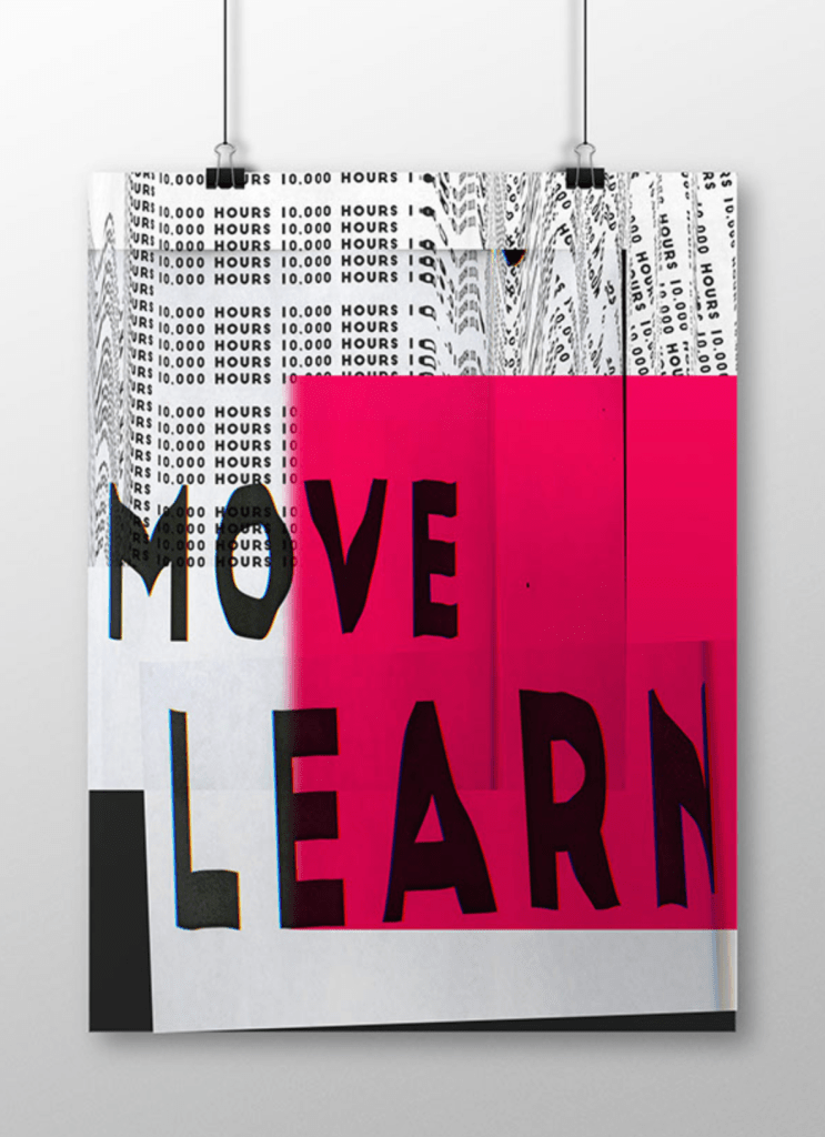
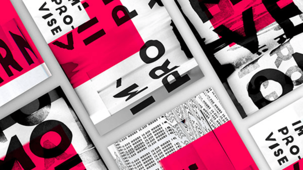
I really loved this week. Experimenting with a printer, scanner and perspective. I had an amazing zoom call with Darius (the author) and He loved them too. No one has ever made anything for his work before and he was really grateful. A very gratifying moment. I came across work from a designer called Sarah Schmidt. She uses a scanner to create these awesome looking posters for an exhibition. I love the addition of colour in these. I also love the fact that they don’t have to be legible. I really want to explore this style again and introduce more mania and colour. Sarah’s work can be found here:
https://www.behance.net/gallery/20654969/The-Process-of-Failure