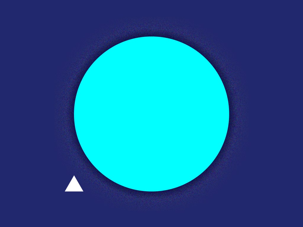
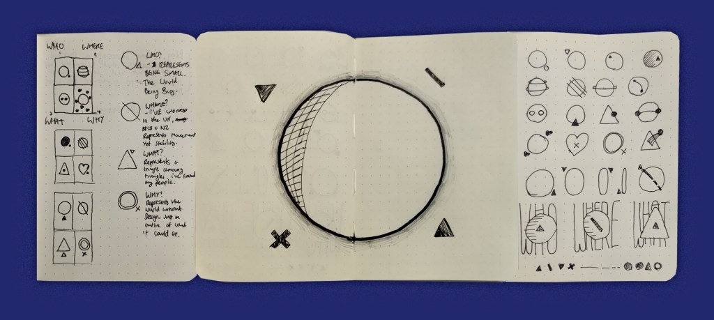
Who Are You?
This image represents several things. The larger shape was/is my world and the little triangle represents me. I realised early on in my career that as a designer for a large corporation I was often overlooked as an asset. “I can do it myself” “It’s just drawing pictures” These were common expressions I encountered. It made me realise how small my slice of the graphic design world was. As a man from a very uniform and homogenous city (not a whole lot of ethnic diversity), I was prepared to put my career on hold and discover the things I hadn’t before.
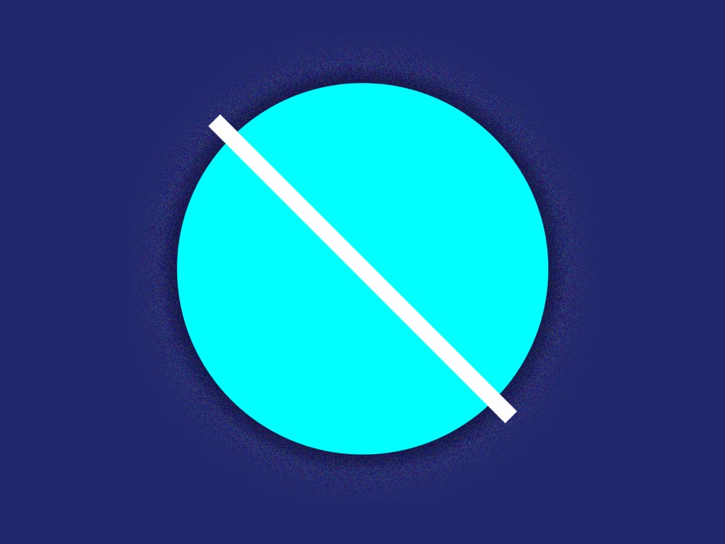
Where are you?
At this moment in time, I don’t have a ‘home base’ so to speak. Geographically I’m all over the place. This image represents my journey from one end of the world to the other. It also symbolises a ‘strike’ through my old world, allowing me to find another. In terms of how I work, I’ve found that the language of design and storytelling is largely universal. As Simon Manchipp of SomeOne puts it “UK ideas work well, globally”.
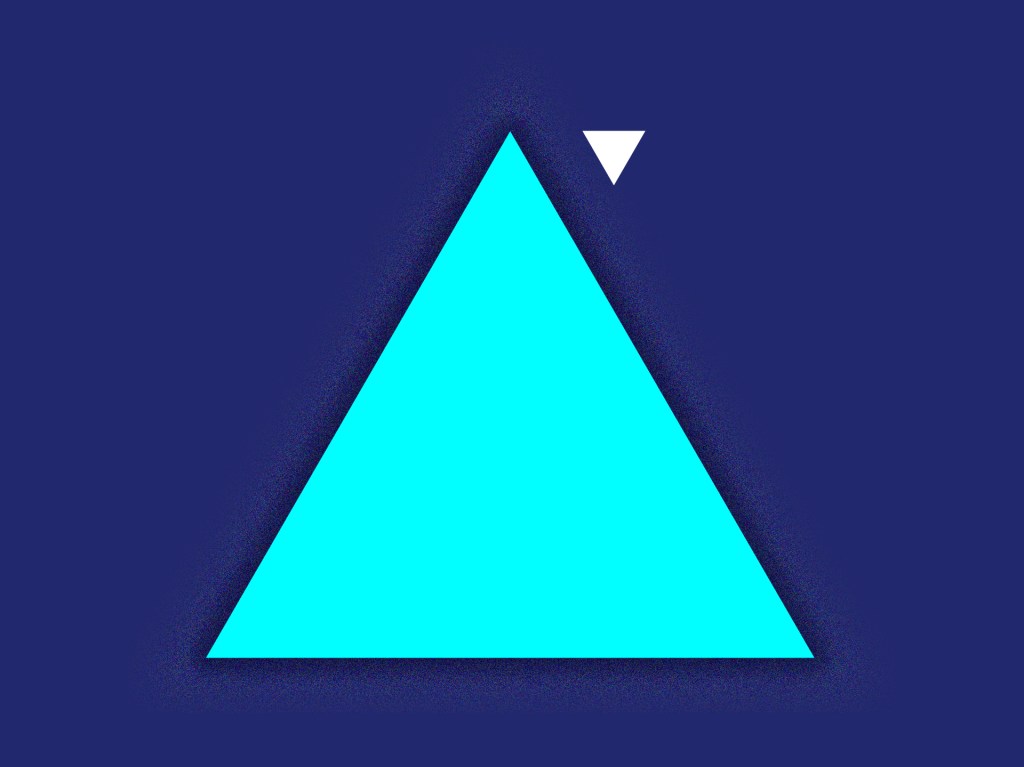
What is it you do?
This is a special one for me. It represents me finding what and who I want to work with. A triangle among triangles. It took a little while but I now know the kind of clients I want to, and most importantly, don’t want to, work with. The people I want around me and the kind of design work I want to take on. Where previously I pretty much just did whatever I was asked, even If I had doubts, now I love to experiment and subvert expectations. I’m a super clean designer and I like it that way.
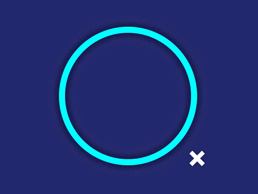
Why Design?
Design is everything, everywhere and in everyone. Without design, wouldn’t the world be different? Design enchants, enthrals, provokes emotions, tells stories. We all grow up with design in our lives. This image represents the world (and myself) without it. An empty husk. I love the reaction from clients when they get a piece they enjoy. I strive for the challenge of a difficult project and the gratification I feel when it’s done. I love the doors that it can open for myself and others. Some don’t even notice it. I love it.
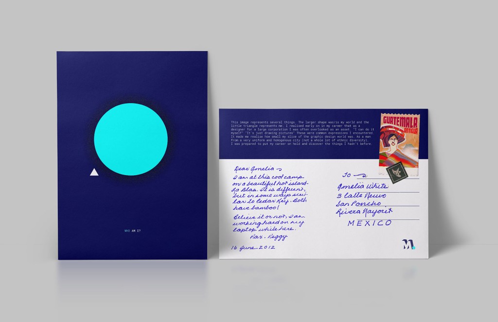
I decided to add some context to this week’s outcome. As the major theme is about me becoming a better person while travelling, I’ve designed this quick postcard which could be sent back home.
Reflection
I enjoyed the simplicity of this week’s outcome. It’s clean and has meaning, that said, if I was to do it over, I would isolate each element as it’s own design. Rather than using the same colour palette for all 4.
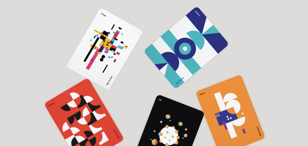

Above is some work by Minal Studio. I have been following them for some time. This piece is called Mind Tourists. It is a personal deck of cards inspired by emotions and music. Each card is unique and striking. They have a story to tell and are all different. Bring them together and they are a brilliant set. I think more styles of illustration and varied palettes would have improved this week’s work from me. Overall though I’m happy with the outcome and am excited for the weeks to come.
To see Minal Studio’s amazing work:
http://minalstudio.com/project/mind-tourists
