This week’s challenge is all about showing who you are. After watching this week’s video lecture I wanted to see more of the work that the guest speakers have worked on. SomeOne’s Simon Manchipp stood out to me as he highlighted the importance of storytelling in Design.
I came across SomeOne’s rebrand of Kings Cross in London. This rebrand focused on giving the area a visual to go along with its voice. They created it to be flexible, clear and colourful. I love the fact that they’ve condensed the full title down to two symbols/letters. For such a bright colour palette it’s great that they only use a few colours at the same time. Having this wide breadth at your disposal can sometimes be daunting but SomeOne handled it superbly.
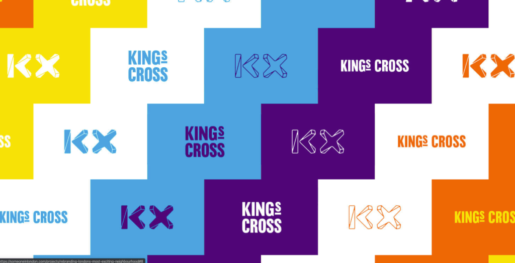


This rebrand shows how cool that the Kings Cross area is. It’s consistent with the historical typography on the side of old buildings yet super fun and modern. Telling a truthful compelling story Is what design is truly about.
To see the full rebrand:
https://someoneinlondon.com/projects/rebranding-londons-most-exciting-neighbourhood
